Atlas Explorer

Designing a powerful, flexible insights platform for experience data
Overview
As AnyRoad scaled its experiential platform offerings, clients needed better ways to explore and act on their data. We built Atlas Explorer to meet that need: a flexible, intuitive reporting tool that gives brands real-time insights into their activations and events. I served as lead product designer, helping define the vision, architect the experience, and design the system that now powers insights across thousands of experiences and millions of data points.
The Opportunity

Brands were running more experiences than ever, but their ability to interpret the results hadn’t kept up. They were overwhelmed by raw data and underwhelmed by the capabilities of our reporting tools.

At the time, our internal tools were fragmented. Insights were buried in static dashboards, CSV exports, and manually assembled decks. Clients wanted more control, more visibility, and more confidence in the data. They needed a better way to ask meaningful questions of their experience data without having to rely on support teams.

My Role

I was the lead product designer on this initiative, partnering closely with the PM, engineering lead, and data team from concept through launch. My responsibilities included:

  • Defining core user flows, architecture, and interaction models
  • Designing modular UI components for reporting, filtering, and drill-downs
  • Prototyping key workflows for internal testing and stakeholder buy-in
  • Collaborating with engineering to refine both data logic and frontend behavior
  • Supporting onboarding for internal teams and external clients after launch
Data experts are well-acquainted with conventional business intelligence tools, but AnyRoad's platform is utilized by individuals in various roles to guide their decisions regarding experiential programs. The challenge lay in establishing a connection between non-expert users and the valuable insights that can be derived from business intelligence tools.
Diverse Use Cases
Different brands, programs, and touchpoints had different KPIs and data structures.
Cognitive Overload
Legacy dashboard required users to navigate dozens of separate reports to see all data.
Large Data Sets
Some clients were running thousands of experiences across global teams, making performance and clarity essential.
Unclear User Goals
Not all users approached the tool the same way. Some needed high-level summaries, while others wanted to dive deep into specific events or regions.
We designed Atlas Explorer to be an elegant blend of power and simplicity: a modular reporting tool that adapts to different types of experiences, brands, and user intents. From drillable KPIs to smart filters that adapt based on context, every element was designed to support exploration, comparison, and discovery — whether you’re a brand manager reviewing one event or an executive looking across regions.
Contextual Exploration
We built dynamic filters that adjusted based on the user’s current view. For example, selecting a specific brand would automatically limit other filter options like location or program type to only what was relevant.
Progressive Disclosure
Instead of overwhelming users with data, we revealed insights gradually. Key metrics appeared at the top of the screen, with the option to dig deeper through charts, filters, or secondary views. This approach helped balance clarity with flexibility.
Composable Reporting
We designed modular layouts that could flex based on the type of experience being analyzed. This allowed the interface to scale as new metrics or formats were introduced across the platform.
Dynamic Metric Cards
Each card displayed a key KPI and included segmentation toggles, allowing users to compare performance across time, regions, or programs without leaving the page.
Smart Filters
The filtering system was rebuilt from the ground up. Filters were now adaptive and context-aware, surfacing only options that made sense based on the user’s selections. This reduced clutter and simplified navigation.
Modular Panels
Chart panels were built on a responsive grid, enabling consistent layouts across multiple types of experiences and use cases.
One-Click Drilldowns
We introduced click-through behavior on charts that allowed users to explore more granular data in a single interaction. No dropdown menus or complex query logic required.
Previous Discovery
Previous workshops and interviews that I conducted for related projects furnished comprehensive background information crucial to this endeavor. Through these efforts, I successfully identified the user base, discerned market needs, and gathered valuable feature requests.
BI Tool Research
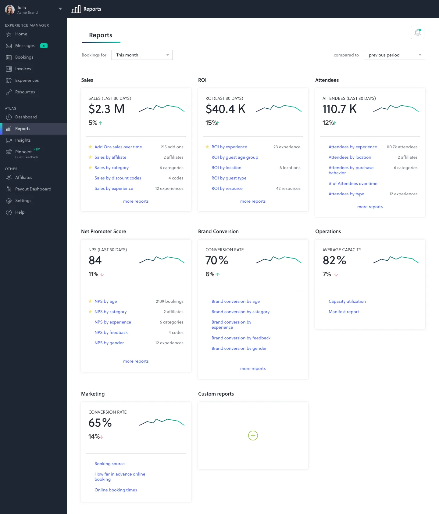
I conducted research to identify the pain points associated with Tableau, the standard tool utilized by our internal team. The primary insight gained was that our non-expert users were unlikely to engage with Tableau for insights discovery.
Analytics Tools
I delved into the examination of consumer analytics tools frequently employed by non-experts. Drawing inspiration from platforms like Google Analytics, YouTube, Facebook Ads, Instagram Insights, and others, I embarked on the mission to craft a user-friendly interface tailored to consumers.
Explorer Frame
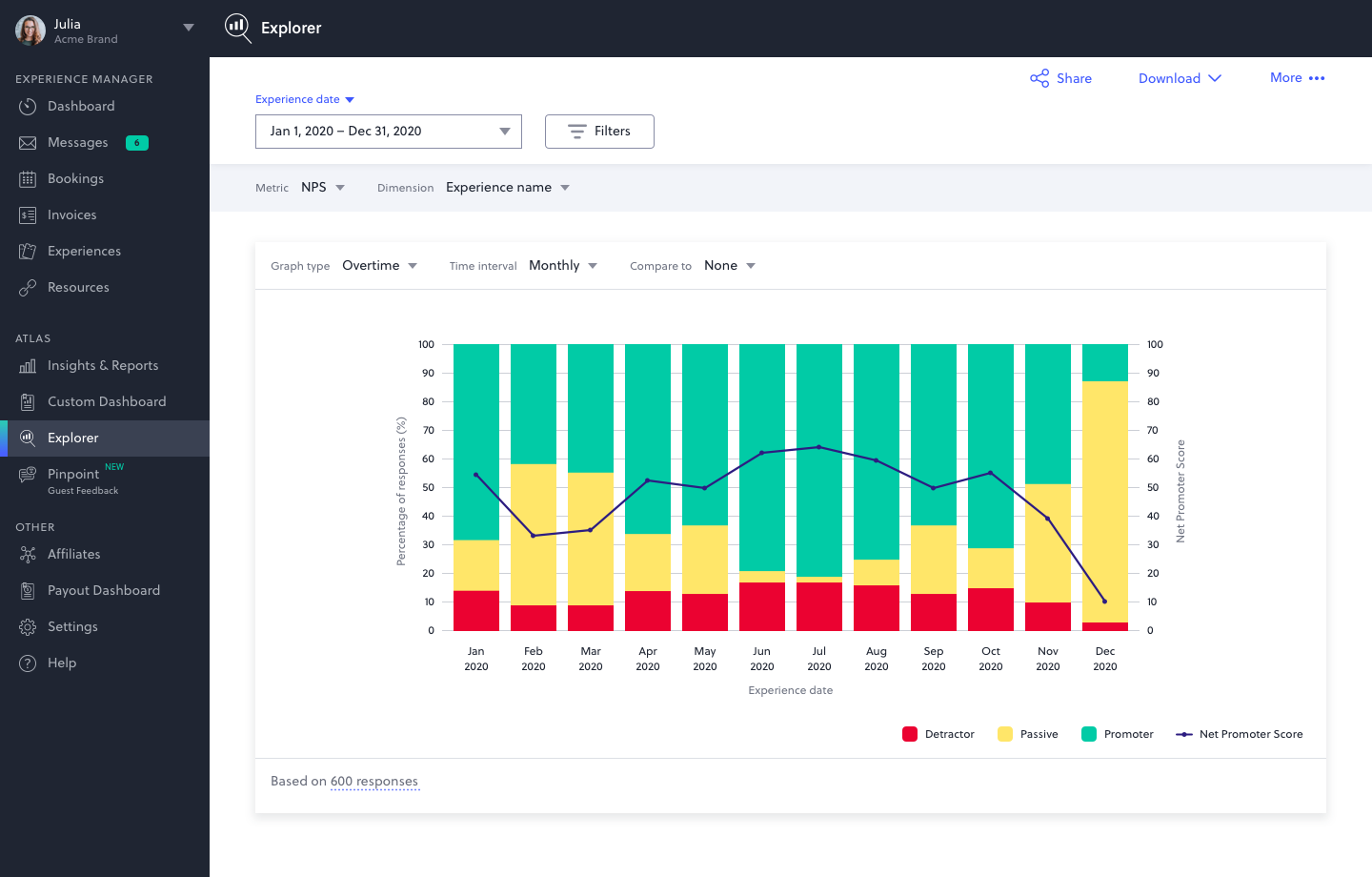
Within the UI framework, I seamlessly integrated an array of features to enhance usability. This includes user-friendly filters for data subset selection and dropdowns for parameter selection, encompassing metrics, dimensions, dimension breakdowns, graph types, and more. Moreover, I incorporated convenient share and download functionalities.
Filters & Selectors
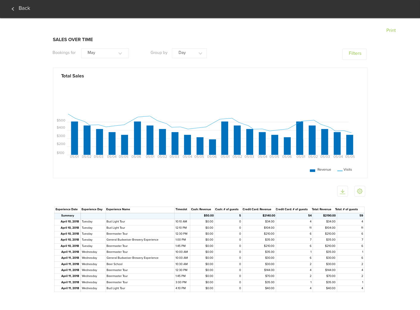
The design of filters and dropdown menus was meticulously crafted, taking into account several key considerations. By leveraging insights gathered from user interviews, I implemented various UX enhancements to ensure an improved user experience. This involved accommodating requests for additional date range presets, the ability to recall recently selected parameters, and the inclusion of multi-select and search features.
Charts & Calculations
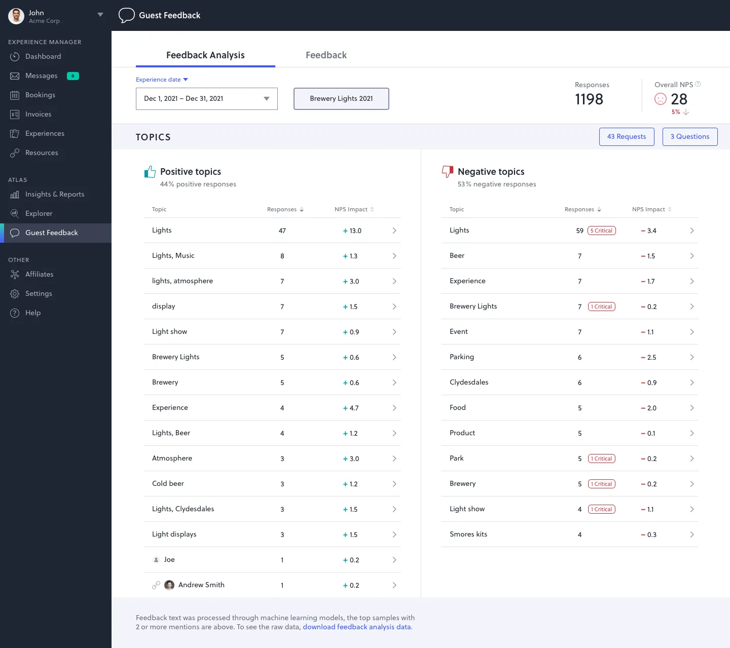
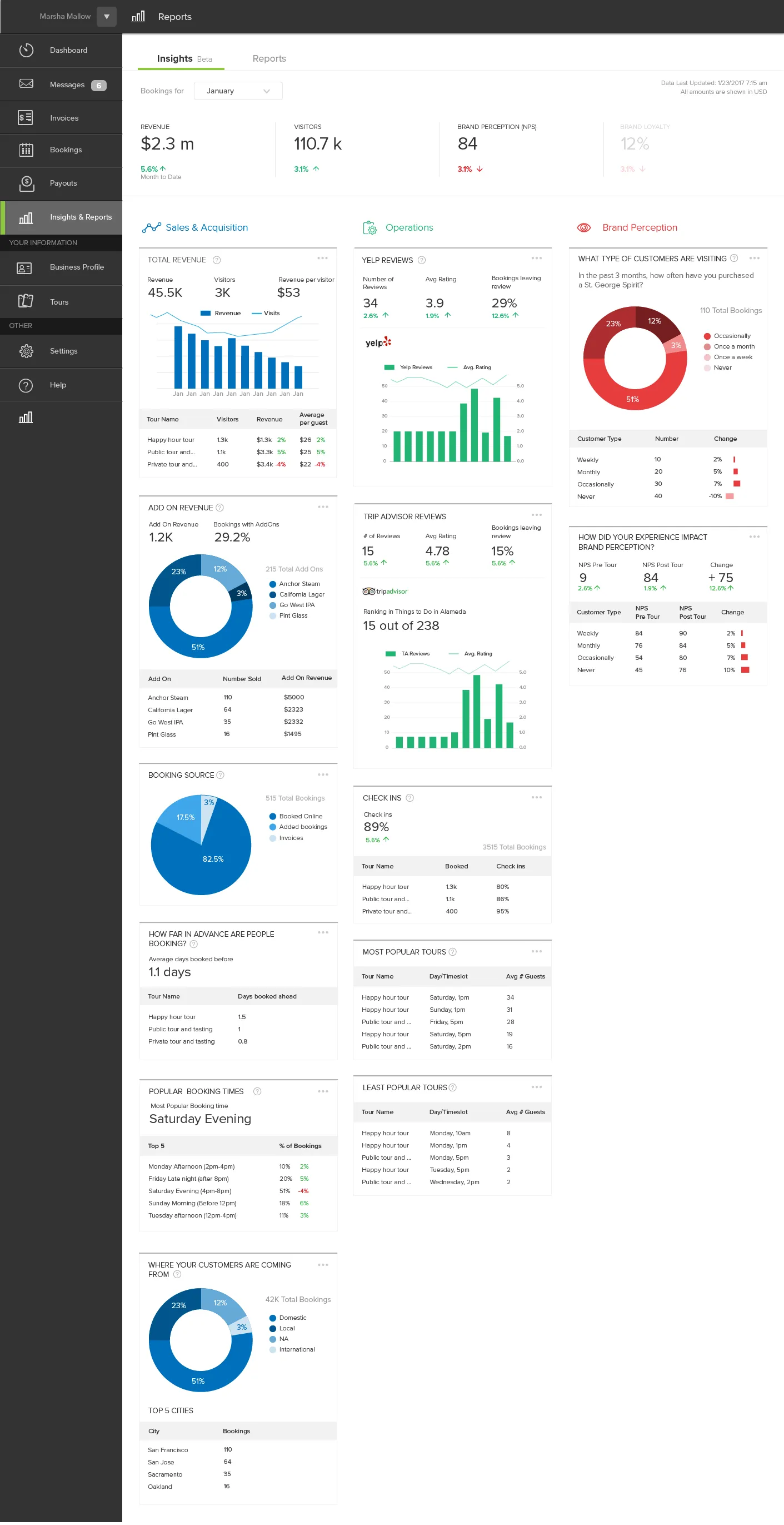
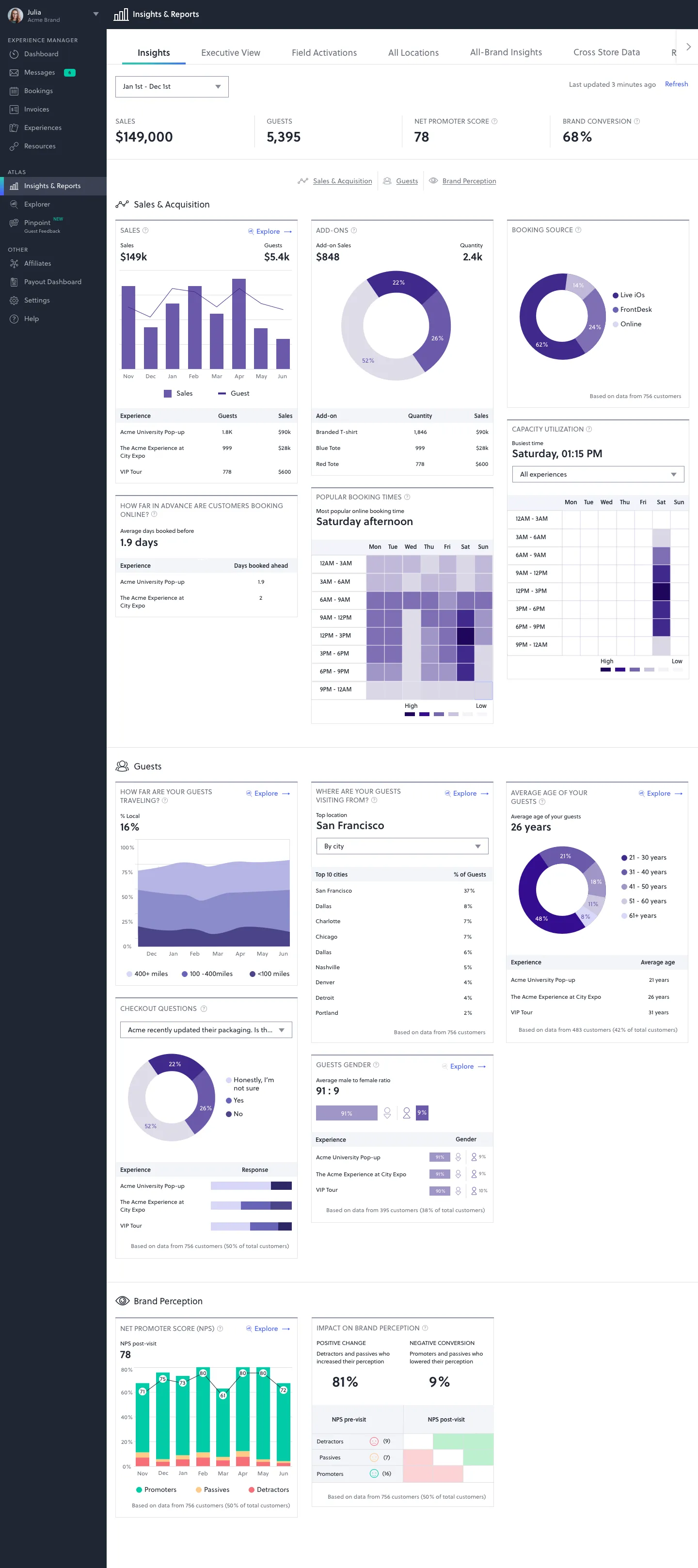
All data within Explorer is presented through visual charts. Drawing from extensive research and valuable user feedback, I established a standardized set of guidelines for chart design and best practices, determining the most appropriate chart types for specific data representations. To accommodate the wide range of chart possibilities, I derived calculations based on the available API data, enabling versatile chart creation.
This project helped me refine my ability to design for power users. I learned how to create interfaces that feel simple without limiting functionality. Working closely with data and engineering teams also taught me how to align user experience with the complexity of backend systems. Balancing flexibility with clarity became a central theme throughout the project.