Designing "Data Gems" for the AnyRoad Dashboard

Turning Insights into Impactful Moments
Project Overview

Timeline: 2021
Role: Lead Product Designer
Team: 1 Product Manager, 2 Product Designers, 1 Engineer
Platform: AnyRoad Dashboard

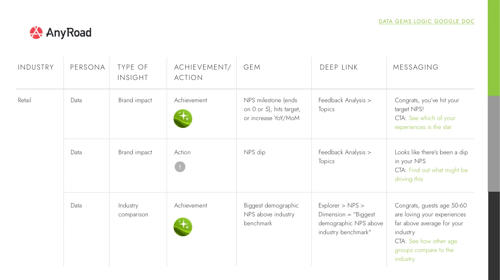
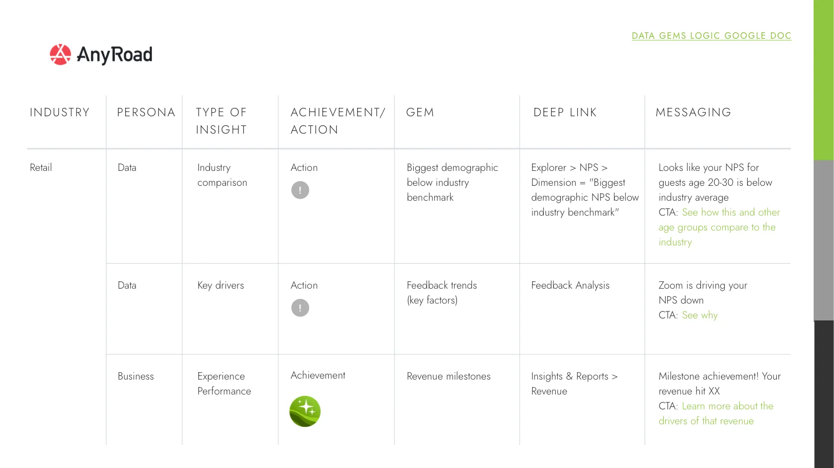
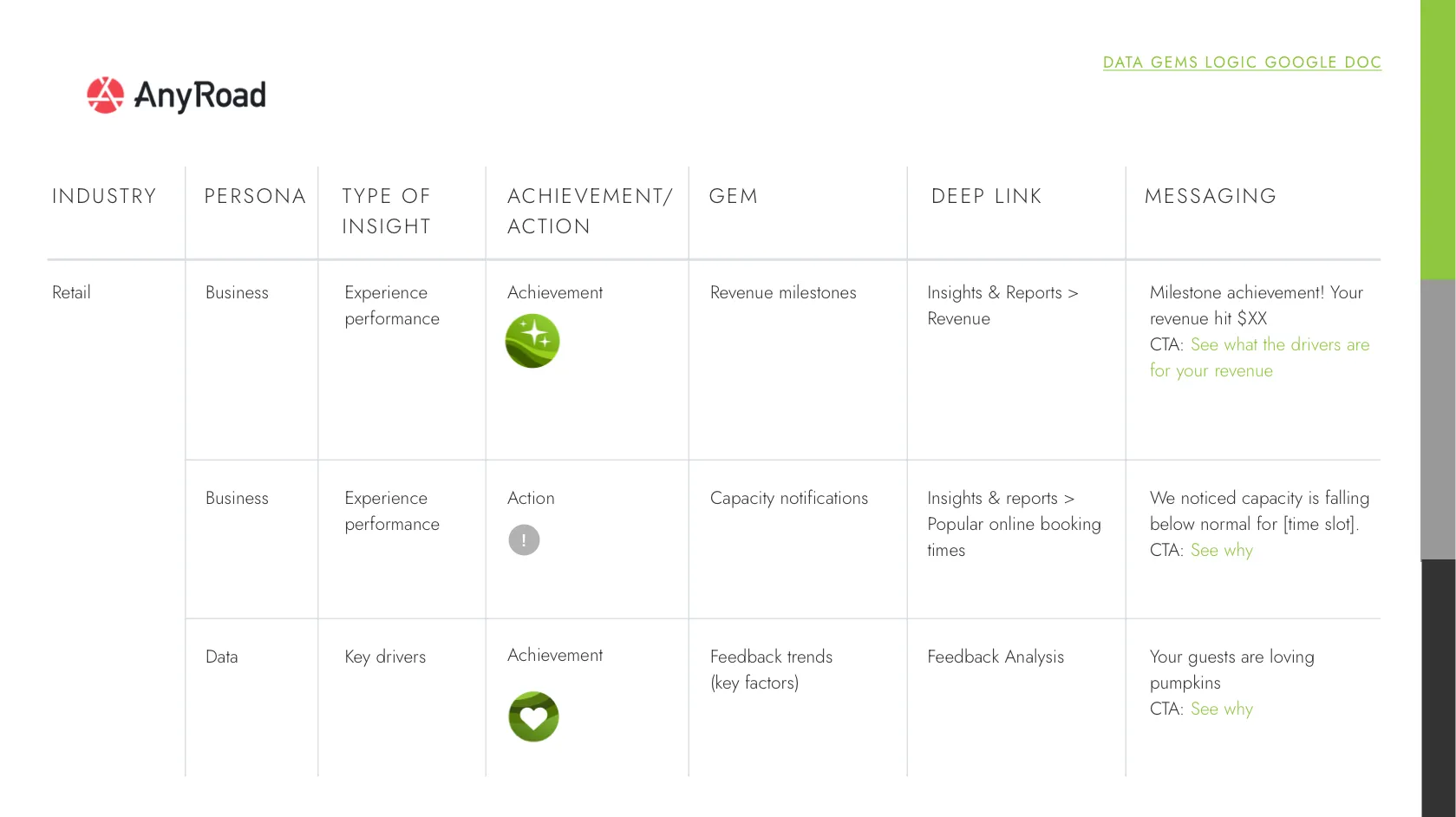
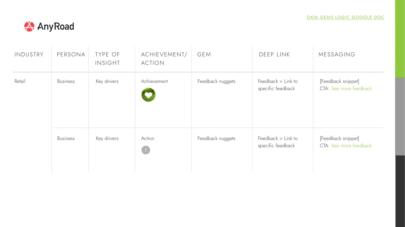
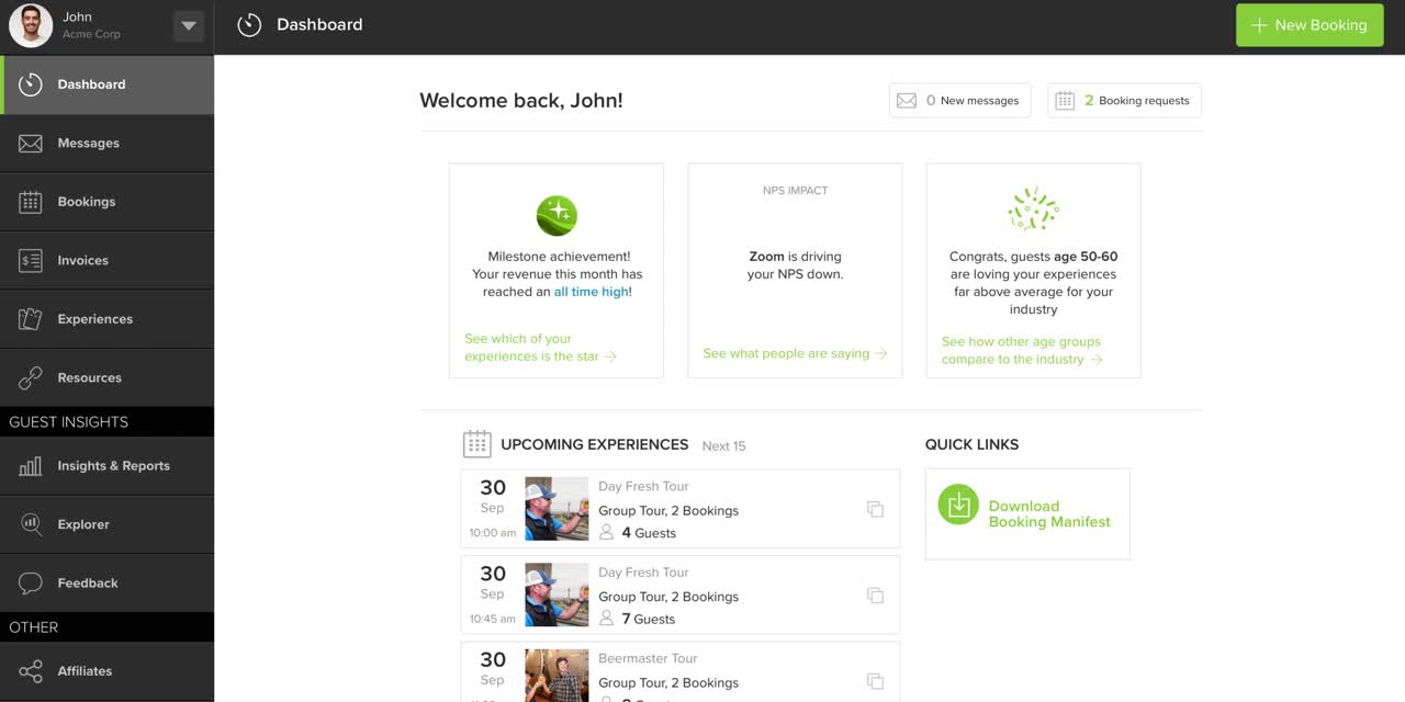
As part of our mission to make insights more actionable, we reimagined the experience of logging into the AnyRoad dashboard. What began as a concept to surface compelling data points evolved into a scalable system of “Data Gems”—insightful, gamified cards that surprise and inform our users, helping them take immediate action.

The Problem

Operators were drowning in raw data and scattered dashboards. Despite having access to rich insights, many users either didn’t log in regularly or didn’t know where to look. We needed a way to:

  • Increase engagement with the dashboard
  • Highlight relevant insights without requiring deep analysis
  • Make it easier for operators to take action on what matters
Our Objectives
  • Surface quick, compelling insights that feel like rewards or moments of recognition
  • Boost dashboard engagement by making the homepage feel more dynamic and valuable
  • Test low-effort ways to drive value perception with real account data
Each card highlighted a unique insight or moment:
We prototyped a working version of 10+ Data Gems, using real customer accounts and backend queries. The MVP included:
Main code infrastructure (React)
Backend routing with sample queries (e.g. 10 latest NPS comments)
Redux setup for dashboard card state
Widget components with placeholder visuals and real logic
Build fast, test faster. Prototypes helped align stakeholders and sharpen the idea.
You don’t need every backend detail to test UX. Fake the hard stuff.
Real data > static mocks. The moment we hooked it up to accounts, everything clicked.
Eng insights in small packages. Gems helped reveal just how much value could be delivered in a tiny footprint.
Outcomes
Prototype was demoed to leadership and partner accounts
Reached alignment to invest in a more robust version post-pilot
Inspired a new card framework for the Dashboard
This was one of the first dashboard design projects where I pushed for high-value UX with low-engineering lift — and it worked. The project seeded a product-wide shift toward modularity and dynamic content. It also proved that delight and utility don’t have to be at odds — small wins, surfaced well, create lasting value.